Tech Enthusiasts Discover Intriguing Feature in iPhone Clock App
iPhone users have focused on an unexpected feature within the latest iteration of the clock app. A recent revelation on a social media platform sparked conversations about Apple’s design approach—whether it’s based on meticulousness or clever power conservation.
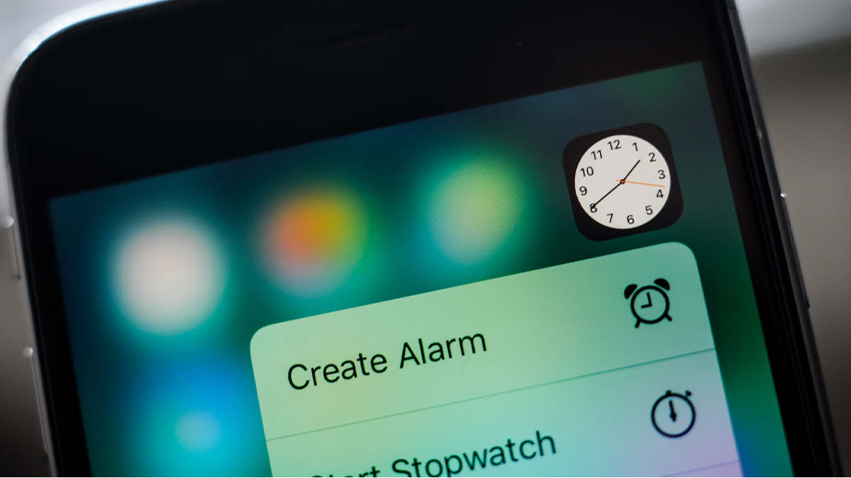
The discussion gained momentum when a user highlighted a peculiar observation regarding the clock icon while exploring phone settings on X. The user pointed out that, “Wait… the Clock icon on iOS ticks like a quartz watch in low power mode and behaves like a mechanical watch in normal mode??? That’s some impressive attention to detail.”
This duality in the clock’s second hand animation hinges on whether the Low Power Mode is active. When engaged, the second hand ticks distinctly, while it glides smoothly in regular settings, suggesting that Apple integrated a thoughtful design choice that simulates different watch types based on battery consumption.
Not all commentators shared this perspective; skeptics argued that the change was more about battery life efficiency. One remarked, “It’s not necessarily a thoughtful design; rather, it’s a simple way to save battery. Animating the entire motion consumes more pixels. When it ticks, there’s less processing involved.”
Another reaction noted, “I suspect it’s just the refresh rate of the always-on screen being reduced to one frame per second.” Others supported this view, indicating that the design choice was likely linked to energy conservation.
Apple’s documentation indicates that Low Power Mode minimizes background activities to extend battery longevity. According to their support page, “When battery levels dip, Low Power Mode curtails activities on iPhone and iPad to prolong battery life.”
Appreciation for this nuance took many users by surprise. One comment observed, “This is even more interesting than it seems— the screen can drop to a refresh rate of 1Hz. Truly innovative!”
Key Takeaways
- Users can sometimes overlook fascinating details within apps and interfaces.
- Engaging users on social media can lead to enlightening discussions about technology features.
- Differences in functionality may arise from design choices intended to conserve battery life, showcasing practical considerations in tech.
- Slight alterations in visual elements can evoke varying interpretations among users.
- Understanding how devices manage power helps users appreciate both utility and artistry in design.