Users Enthusiastically Embrace Blur Features in Android 17
The latest trends in mobile design have revived blurring effects as a contemporary aesthetic. Google’s upcoming Android 17 focuses on blurred visuals to create a unique user experience, contrasting sharply with the solid, defined aesthetics of the past.
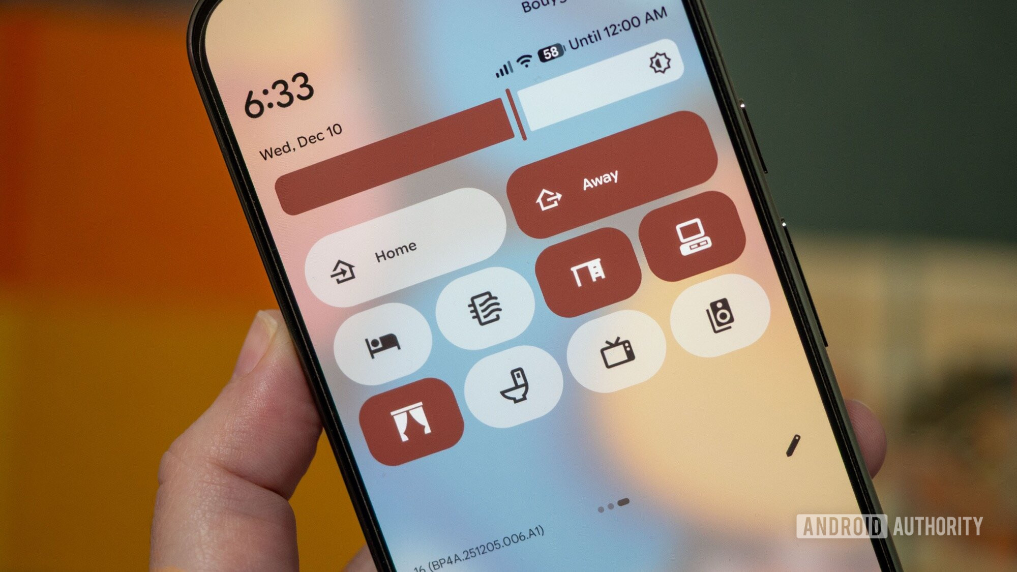
Initial leaked screenshots provide a glimpse into this design philosophy, showcasing softened lines and blended colors. This approach allows background elements to subtly seep through the interface, enhancing the overall experience. While some skepticism exists, excitement about this design shift is palpable.
Informal polls gauged public opinion, revealing a strong leaning toward acceptance of the new blurring technique. Approximately 75% of participants appreciated the creative choice or expressed cautious optimism, suggesting openness to this new aspect of Android’s interface.
Survey Insights
Views diverged on how effectively the new design incorporates blur. Some readers found the blur interesting but suggested it might require more nuance. Others criticized the design, likening it to an imitation of iOS features. A few expressed discomfort with transparency in user interfaces, while others desired greater customization, hoping for options to adjust the intensity of blur effects.
Analyzing the iOS Comparison
A theme in the feedback was the concern that Android 17 mirrors Apple’s design—specifically the “Liquid Glass” effect seen in iOS 26. Half of the survey participants felt this concern was overstated, arguing that Android’s blurring effects reflect a different approach. The ongoing dialogue revealed a dichotomy; some believe Android’s take on blur stands apart from iOS.
As the Android 17 experience evolves, it seems Google is aligning development with consumer desires. However, the design’s reception will depend on balancing innovation with user expectations.
Key Takeaways
- Design Evolution: Android is moving toward a more fluid, blurred interface.
- Public Polarization: Feedback is mixed, with a majority showing tentative support and some remaining critical.
- Customization Requests: There is a strong demand for user control over the intensity of blur effects.
- Distinct Aesthetics: Many argue Android’s approach is not an imitation of iOS but represents a unique design perspective.
- Ongoing Feedback: The conversation about Android 17’s design is active, with users eager to share insights as new features emerge.
What are your thoughts on the direction Android 17 is taking? Share your perspectives below; your input adds to this evolving discussion.